
- Menu
- 50 Second Idea
-
Featured
-
Featured
- Recent
-
- Schedule a Call
Select Page


This wasn’t the first logo we’d designed for Greg. Initially, he named his business Greg Merchant Bookkeeping (you can see that logo here). But it’s not uncommon for businesses to refine their brand as they go along, and after a few years, he decided to drop his name and rebrand as simply Merchant Bookkeeping. He wanted the logo redesign to be compelling and to capture people’s attention. And as an incredibly conscientious, by-the-books man, he wanted it to feel trustworthy and reliable.
We kept it simple with bold initials, but played with outlines and filled in spaces to make it unique and interesting. And we used shades of blue to emphasize his no-nonsense approach to bookkeeping.
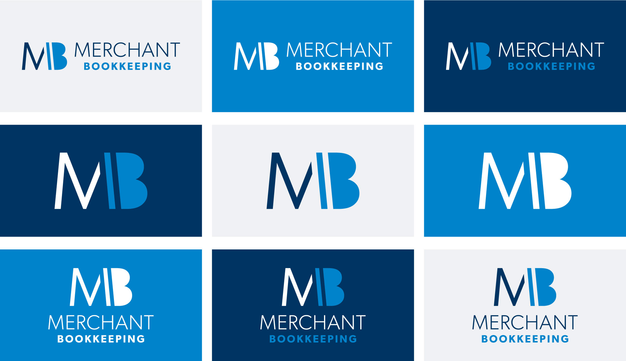
Greg needed a bold business card that would stand out, so we used the deep navy as a background to contrast with his white and bright blue logo.
In addition to having a great logo and business card, Greg needed a simple website that validated his business and reinforced the conversations he was having with business owners. We worked with him to create a simple one-page site that could accomplish everything he needed without the hefty price tag. See how we did it →

As your business grows your needs and exposure will change. And a redesigned logo can play a significant role in establishing your company in a new or expanded marketplace.
Schedule a call today, and let’s get started!
Get started by downloading our FREE Branding Guide, and begin building a successful brand for your business.
Every logo we design is unique – tailor-made to represent a company’s vision, personality, and values. Take a look around.
