
- Menu
- 50 Second Idea
-
Featured
-
Featured
- Recent
-
- Schedule a Call
Select Page

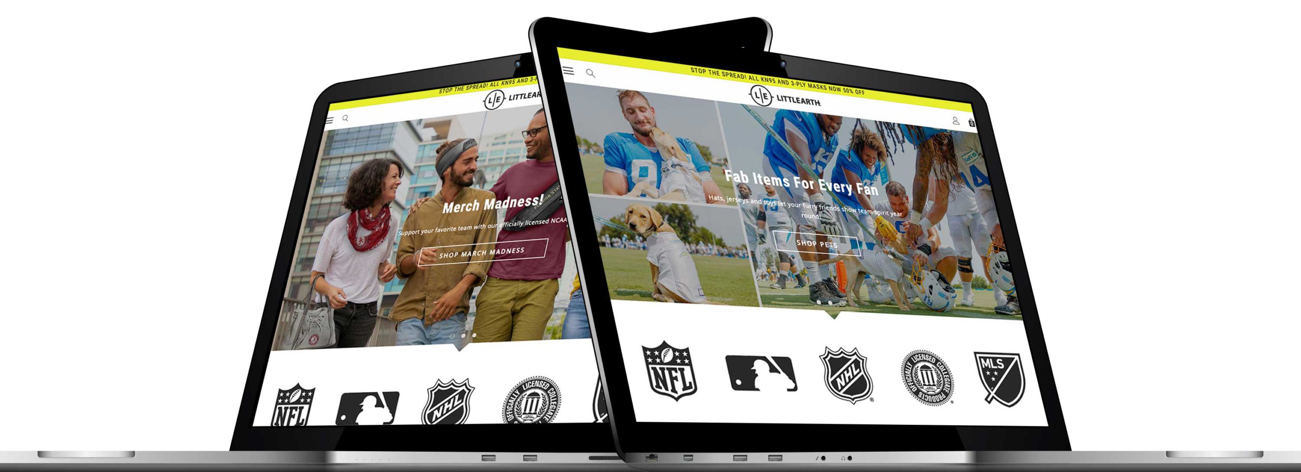
LittleEarth has been around for years creating accessories and apparel for professional and college teams. They were having a lot of success selling online, but knew they could do even better. Their website was functional but not very engaging. And they were having a hard time organizing all their products in a way that was easy for potential customers to navigate. We helped them reorganize the products by setting up filtering options. We also enhance the menus and redesigned the homepage.
Their sales nearly doubled the first weekend the new website went live.
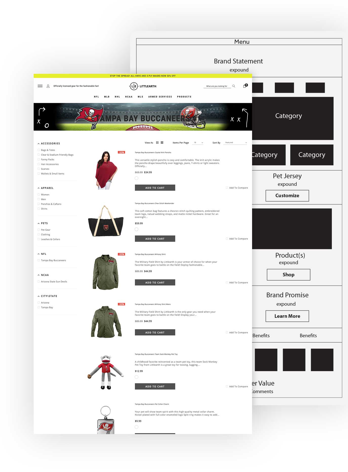
We like to start web projects with some simple sketches. This lets us strategize before we create, making sure that each component is placed to create a clear and compelling experience for website visitors. Having a plan also makes it easier to write effective text and choose great photos.
Littlearth needed a website that would appeal to fans across the country for a wide variety of sports. Each website visitor needed to be able to quickly find their favorite team and the products that matched their interests.
We started by setting up the navigation with expansive menus that were organized by sport. And we used the homepage as a place to let shoppers see the variety of items offered for each team.
Next, we worked with the Littlearth team to set up a filtering system and create tags for each product that would allow customers to quickly narrow down to products they were interested in. So once a visitor had navigated to their favorite team’s page they could sort products by gender, accessories, decor, etc.
Simply making it easier for customers to find products they loved for their favorite teams had a significant impact on Littlearth’s online sales.


Most people will decide if a business is trustworthy within a few seconds of visiting their website. Design plays a key role in this decision. And it’s not just about having great photos at the top of the homepage, although that is a must! Everything is important, from the words on the page to the colors, logo, and fonts. And they all need to work together to communicate the brand message from a variety of angles, over and over again, building trust and creating an enjoyable, trouble-free experience for each visitor.
It’s important to note that Littleath experienced great results after updating their website because of the organizational changes and the enhanced, more appealing look of the site. Essentially a website needs to look great and function optimally. Having one without the other won’t produce the same results.

If you need a new website or just a refresh to make your existing site more effective, we can help with design that’s optimized to achieve the unique goals you have for your business.
Still have questions? Contact us.